January 21, 2026
Design Tips & Trends / Home Staging Design / Home Staging Insights / Interior Design
Coffee Table Styling for Luxury Listings: Elite-Level Restraint
Coffee table styling for luxury listings is rarely about the table. It is about the buyer’s nervous system in the first sixty seconds, and what the room quietly tells them about who lives here, how they live, and what it would feel like to belong. In high-performing markets, you do not win on square footage alone. You win on perception, and perception is built in details that read as inevitable.
A coffee table sits at the center of that perception. It’s the surface your eye lands on while you’re deciding whether the living room is calm or chaotic, curated or improvised. If the styling feels accidental, the listing feels negotiable. If the styling feels composed, the property feels considered, and consideration translates to confidence.
The Coffee Table as a Quiet Leadership Signal
In luxury environments, “style” is not decoration. It is editing. It is the ability to remove what is unnecessary and still communicate warmth. It is also a form of authority: the room is telling the buyer, without speaking, that this home is managed.
This is why coffee table styling for luxury listings has to operate like brand design. Brand design is not about adding more. It is about aligning sensory cues with an identity the buyer wants to step into. The most compelling living rooms are persuasive because they are coherent.
If you’ve ever read a room and immediately felt the caliber of the people who move through it, you already understand the principle. The coffee table is a micro-version of that experience. It can convey discretion, intention, and taste in under five seconds.
What Buyers Actually Read on a Coffee Table
Buyers do not consciously inventory objects. They absorb signals: cleanliness, care, pace, and social posture. They register whether the home feels like a showroom, a private residence, or an overfurnished catalog. The goal is none of those. The goal is an aspirational neutrality that still feels human.
This is where many listings lose value. Not in the architecture, but in the emotional bandwidth of the presentation. A cluttered coffee table reads like a cluttered life. A sterile table reads like avoidance. A well-composed table reads like ease.
For a useful parallel, look at how design media evaluates interiors: not by abundance, but by tension, proportion, and restraint. Publications like
Architectural Digest rarely celebrate “more.” They celebrate the intelligence of what was chosen and what was left out.
The Elite Framework: Three Objects, Three Textures, One Point of View
When I style a coffee table for a high-end listing, I start with a discipline: one point of view. The table should echo the home’s narrative, not introduce a new one. That means you choose a lane, then you commit.
Here is the framework that consistently photographs well and reads as expensive in person. Not because it is expensive, but because it is controlled.
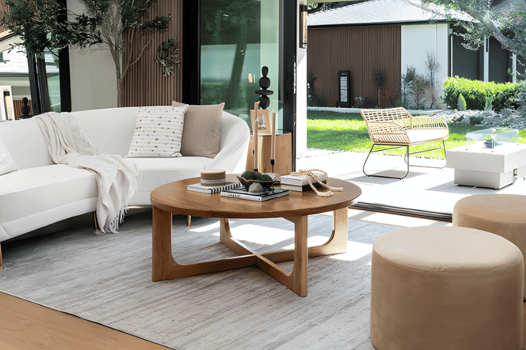
1) Anchor with a single, substantial piece
Use one grounded object as the visual “base.” A large art book, a refined tray, or a low, architectural bowl works. The anchor is not there to impress. It is there to stabilize the composition and keep everything from looking like it’s floating.
Art books are classic because they carry cultural associations, but choose them like you choose a wardrobe: clean, intentional, and aligned with the home. No novelty titles. No tourist energy. A single volume with a calm cover can do more than a stack of five that feel performative.
2) Add one organic element that feels inevitable
Organic does not mean rustic. It means life, softness, and a signal that the home has oxygen in it. A small arrangement of sculptural greenery, a branch in a refined vessel, or a simple bowl of citrus can work, depending on the property.
The mistake is scale. A tiny arrangement reads like a leftover. An oversized arrangement becomes a centerpiece and interrupts sight lines. On a coffee table, organic elements should feel like a quiet note, not a speech.
3) Finish with one tactile, functional object
This is where the home becomes believable. A lidded box, a small sculptural object, or a minimalist candle suggests how the table is used. “Functional” here is psychological, not literal. You are implying a lifestyle without turning it into a scene.
Texture is the differentiator. A matte ceramic, a honed stone, a brushed metal. The table should have at least three tactile moments so the photo doesn’t flatten, especially under bright listing photography.
Proportion Is the Difference Between Curated and Crowded
The fastest way to lose the room is to ignore proportion. If your coffee table styling overwhelms the surface, the room feels tight. If it’s too small, it feels unfinished. Luxury is often just correct scale executed with calm.
As a working guideline, aim to leave at least 40% of the surface visibly clear. That negative space reads as confidence. It also allows buyers to mentally place themselves in the room. A fully occupied surface gives them no entry point.
Height matters too. Keep most items low enough that a seated person’s sight line across the room stays uninterrupted. The eye should travel to the architecture, the view, the fireplace, the art. The table is support, not competition.
A Real Listing Moment: When the Coffee Table Changed the Conversation
One of my favorite examples is a modern condo we staged for a developer who had done everything “right.” Clean lines, strong materials, high ceilings. It photographed well, but showings were lukewarm. Buyers admired it, then emotionally disengaged. The feedback was always some version of “beautiful, but…”
When I walked the space, the issue wasn’t the sofa or the lighting. It was the center. The coffee table held an overstyled stack of glossy books, a bright floral arrangement, and several small objects that felt like a boutique display. It looked busy, and in a quiet modern shell, busy reads as insecurity.
We replaced it with a single substantial book on architecture, a stone tray, and a low ceramic vessel with one restrained stem. The room immediately felt slower. At the next showing, the agent called to tell me the buyers stayed longer in the living room than anywhere else. They started talking about how they would host, where they’d put a record player, how the evenings would feel. That is buyer intent. It begins when the space stops performing and starts holding them.
Design Psychology: Why Restraint Converts
People do not buy homes purely rationally, especially at the top of the market. They justify rationally, but they decide emotionally. The strongest staging choices reduce cognitive noise and increase emotional clarity.
Research in consumer behavior consistently points to emotion shaping perception of value and decision-making. When leaders want to understand why presentation changes outcomes, they often look beyond design and into brand psychology. Publications like
Harvard Business Review have explored how emotion drives customer experience and loyalty. A listing is a customer experience, whether we admit it or not.
Restraint works because it creates a sense of control. Control reads as quality. Quality reads as price integrity. That chain is subtle, but it is real.
The Materials That Read High-Caliber on Camera
For coffee table styling for luxury listings, the camera is a stakeholder. Some materials photograph as premium even when they are modestly priced, and some expensive pieces photograph poorly because they reflect light, skew color, or create visual noise.
What tends to read well: honed stone, matte ceramics, warm metals with low shine, natural fibers with tight weaves, and glass used sparingly. What tends to read as chaotic: mirrored trays, high-gloss lacquer in bright colors, novelty objects, and anything with text facing the camera that forces interpretation.
Design culture is moving toward tactile minimalism and intelligent reuse, not sterile perfection. You see it in contemporary product design coverage from places like
Dezeen, where the emphasis is often on form, restraint, and material honesty. That is the direction buyers are already being trained to want.
A KPI That Matters: Time-in-Room and Offer Confidence
In a strong listing, you can feel when the buyer’s body slows down. They linger. They look out the windows longer. They start speaking in future tense. Agents track this informally all the time, and it correlates with seriousness.
One practical KPI I watch with agents is average time spent in the main living space during private showings. When the living room reads as composed, it is common to see that time increase by 20% or more, simply because the room becomes emotionally legible. Longer time-in-room is not vanity. It increases the chances the buyer forms a personal narrative, and narratives create offers with fewer concessions.
Market data supports the broader principle that presentation influences outcomes. When media like
The Wall Street Journal’s real estate coverage discusses buyer behavior, it often circles the same truth: people pay more readily for what feels turnkey, confident, and ready to inhabit.
What to Avoid: The Subtle Mistakes That Cheapen the Room
There are a few errors I see repeatedly in high-end listings, usually because someone tried to make the table “interesting.”
First, personal clutter disguised as styling: remote controls, coasters with logos, mail, business cards, or niche books that narrow the buyer. Second, overly literal storytelling: a wine bottle and glasses, a board game, travel souvenirs. Third, symmetry that feels rigid. A coffee table is not a mantle. It should feel balanced, not staged for inspection.
Most of all, avoid desperation. If the table looks like it’s trying too hard, the buyer assumes something else is trying too hard too.
The Outcome You’re Actually Buying
High-end staging is not about objects. It is about compressing a lifestyle into a single glance. Coffee table styling for luxury listings is one of the most efficient places to do that because it sits at the emotional center of the room.
When the table is right, the entire living space inherits authority. The buyer may never articulate why, but they will feel that the home is worth protecting, worth competing for, and worth paying for without negotiation theater.
That is the work. Not decoration. Decision design.
Explore Elite
Samantha Senia is the
founder and principal of Elite Home Staging and
Elite Maison, where she leads with an eye for emotional precision, spatial psychology, and aesthetic intelligence. Her work reshapes how space communicates identity, influence, and intention in interior design for luxury real estate.